Those are both great fonts, especially the first one, but they're really display fonts - used for posters or logos. Not for the main body of text on a website.
The first one isn't one that you can actually use in coding a website, it's a hand drawn font and as soon as it's made small, the fact that it's a bunch of jockstraps is lost. The second, while technically could be used in the main text of the website it would make the site far from legible - as the lower case fonts are simply upper case fonts but smaller.
I actually came across the hand drawn font many years ago - it's quite brilliant.
Any idea where the Athletic Supporter font is from? Is it an actual font from some old jock brand? I don't recognize it.
Speaking of fonts and logos: The original Jockstrap Central logo was a font based on traditional collegiate lettering. It was done in red white and blue with a star.
View attachment 6039
I changed it quite a few years ago as I found the colors too difficult to use with the coloring of our photos and the garments - not to mention that a logo that long was hard to read when used in small format vertical advertising banners. The dot com part was important back in 2005 when the Internet was new to so many people, it reinforced the fact that Jockstrap Central was a website. But now dot com is redundant. If you type JockstrapCentral or Jockstrap Central into any search engine our website will be listed in the results.
Our logo now still uses the same font in a solid rectangle (no outline). I take liberties changing the color of the rectangle and font to match what's going on in the graphics I create. Many people into identity graphics would probably cringe but oh well.


 57EDF86F-72DC-4856-B7F7-D3AC7EB4B9BB.jpeg121.4 KB · Views: 181
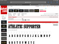 930F7959-E06F-458F-9D13-F563492C4536.png795.6 KB · Views: 189
")